Concord Website
Designed with a grungy and rough aesthetic to reflect the core of cleaning and restoration work. Each aspect of the sight was created to display the level of destruction Concord is use to dealing with.
reusability
The Concord site was designed as a versatile template, easily customizable to meet the specific needs of each client. Allowing future clients to quickly achieve a site that not only looks great but is also effortlessly usable. This ensures a smooth and efficient process, delivering a professional and functional website in no time.


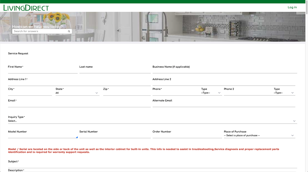
Living Direct Application
The Living Direct Application was designed to model the companies current brand and corporate ascetic. UI and UX principals were used to make FOBS useable to both internal employees and external users to enhance effectiveness and efficiency of the Living Direct call centers.
User Experience Design
This app was designed to be accessible for people with disabilities, such as, those using screen readers, individuals who are colorblind, and users navigating without a mouse.

plan2create
P2C originated from a passion for scrapbooking and has since evolved into an excellent source for custom daily planners.
Front end design
Create a centralized hub to showcase content from Plan2Create’s YouTube channel and Instagram page, while also facilitating product distribution.
The website and brand were designed to complement the stamps, patterns, and swatches characteristic of Plan2Create’s products.


© 2022 Richard Landauer. All rights reserved.
We need your consent to load the translations
We use a third-party service to translate the website content that may collect data about your activity. Please review the details in the privacy policy and accept the service to view the translations.